Texteditor – Redesign Etherpad
During the case study in the summer of 2018, an intensive working day was spent working out drafts on how the existing Etherpad software could be extended with additional functions and how the user interface could be extended.
Intro
Collaborative work using software offers many opportunities for distributed groups to complement each other despite spatial distance or to simultaneously perform an effort at the same location. The open source software Etherpad offers an easy introduction to this when it comes to text creation. However, the free product is almost too simple for certain requirements.
Structure
Etherpad can be configured differently during installation. For example, for structured texts it helps to give the user the possibility to insert titles. For other areas, the software does not offer the user any visual help, but the text serves as a universal “interface”.
Problems
The problems with Etherpad are as diverse as the applications. The following problems have been taken into focus for the day:
- Personal comments/documents/notes that are not visible to others must be captured outside of Etherpad and cannot be given to the document in context. Personal enrichment of the document should be possible. The solution found for this problem should also work for public (i.e. visible to all) enrichments.
- Tasks resulting from the text are not visible without reading the text in depth and there is no progress indicator about already completed tasks.
Analysis
After a short introduction, the students made an analysis of already existing software products, which were then discussed collectively.
Analyzed products
Dropbox Paper
- Strong comment function (single words or lines can be commented)
- ToDo’s can be assigned directly in the document - users are notified.
- Possibilities for adding further content (images, tables, …) are very well integrated.
HackMD
- Input is made using the Markdown markup language.
- Difficult to use for normal users
- Direct integration with GitHub to store data (private) using Gist
- No comment function
- Integration of various services for video/slideshows/images
- Automatic navigation creation (Table of Content)
Confluence
- Payed service
- Works best with other products from Atlassian (Jira & Confluence)
- No comment function directly in Confluence (comments must be added in Jira)
- No private comments
Github Issues
- No real-time editing with other people
- A repository contains Issues.
- Tasks can be created via Issues
- People and teams can be assigned to issues
- Issues are summarized in milestones (with progress indicator)
- Milestones can be scheduled
- Issues can be sorted by milestones and labels
Redesign
Design “Focus”
Severin, Nicole and Matthias have developed a draft with a central focus on the text and the user interface elements are context-sensitive.
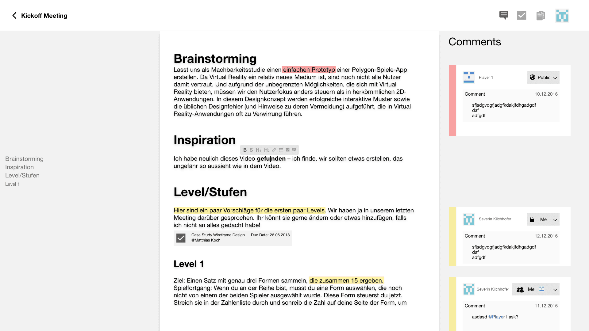
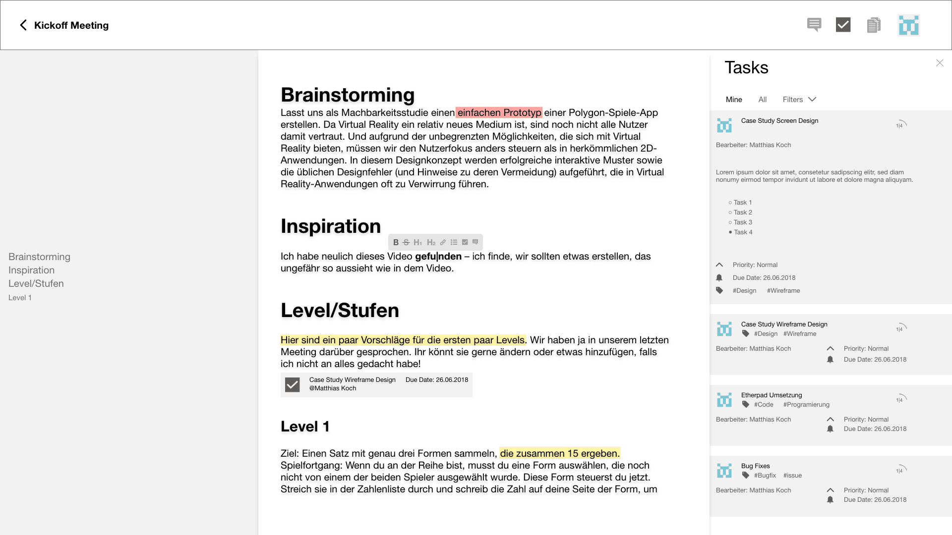
Positive
- Clear interface concept
- context sensitive formatting
- Table of contents helps to navigate in the document
- Task management very sophisticated
- Good visibility of public/private in comments
Inputs/Improve
- The creation of comments and tasks is not yet shown (view already).
- Use color system of comments (including avatar) also for tasks.
Overview
★★★★★ - Technology
★★★★★☆ - Contents
★★★★★☆ - Interaction
★★★★★☆ - Concept
Redesign
Design “Sidebar”
The design of Nils, Lars, Marius, Natasha is based on a sidebar which can be used for comments, files and tasks. The creation is done with a layover directly in the text.
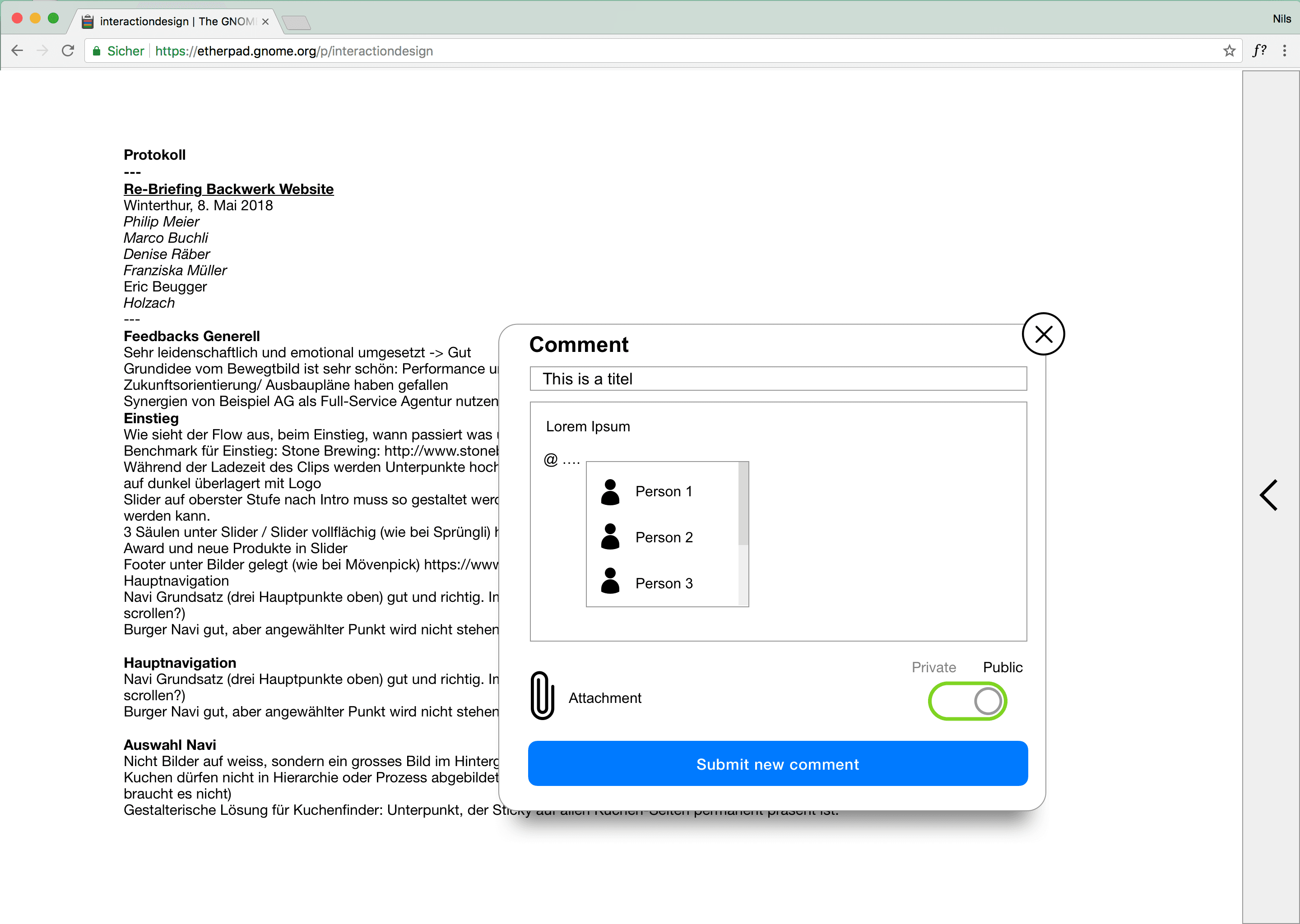
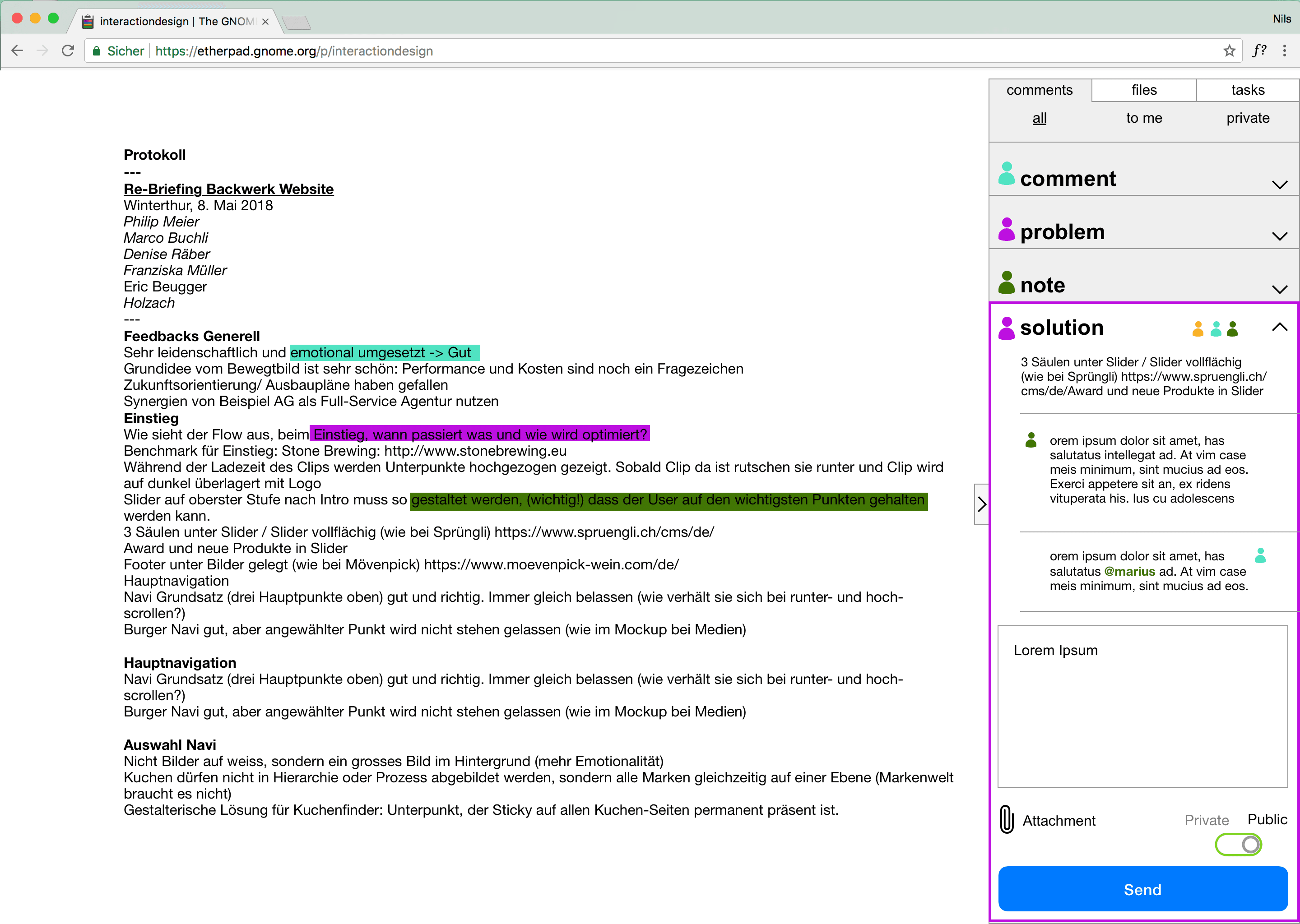
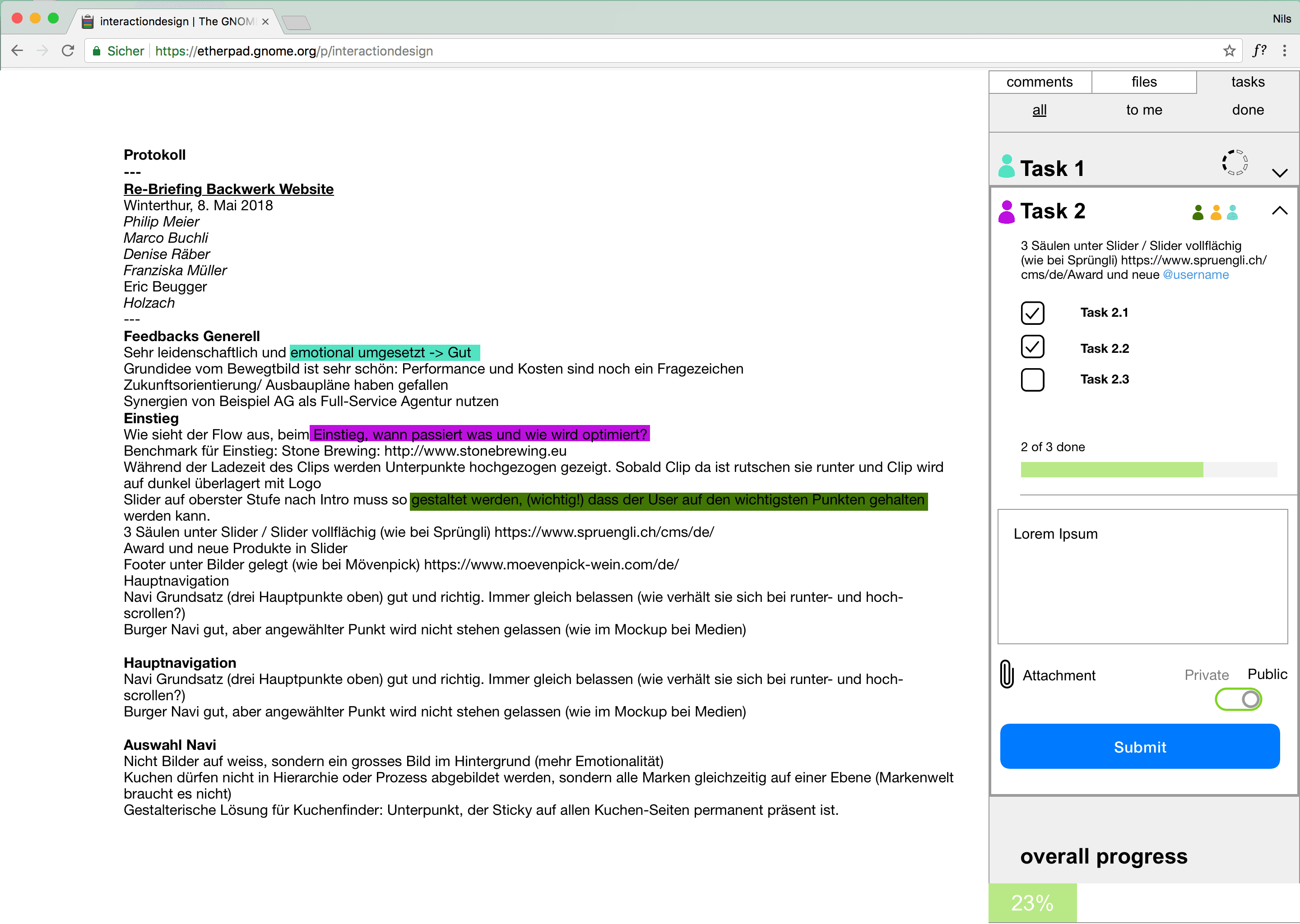
Positive
- Clear interface concept
- context sensitive formatting
- Table of contents helps to navigate in the document
- Task management very sophisticated
- Good visibility of public/private in comments
Inputs/Improve
- Public and private is not 100% understandable with the slide switch, but this is very important here. At best a dropdown.
- Tasks are not visible in the text (for comments solved with color).
- Filtering of tasks/comments visually still too much like a link.
- three different symbols (segmented circle, bar in number of steps, bar in percent) for progress indicator probably not ideal.
- Very long lines in the text. Limit maximum width at most.
- The collapsed sidebar doesn’t animate to be opened, because you can’t see what’s behind it. If necessary, introduce three icons for comments, files and tasks there. Click on it opens in the right tab.
Overview
★★★★★ - Technology
★★★☆☆ - Contents
★★★☆☆ - Interaction
★★★★★☆ - Concept
Draft “Separation”
Tiö, Wolfgang and Marc have created a design in which they have very clearly distinguished the separation of public and private additions. So the notes are always private and the comments are always public.


Positive
- Clear separation of private and public supplements
- Context-sensitive formatting and insertion of additions
- Table of contents helps to navigate in the document
Inputs/Improve
- You would still have to explain in the interface that notes are private and comments are public (very important not to confuse).
- Visually you could have displayed more information in the text for tasks. See draft “Focus”
- Use consistent labels (Post it & Save)
- Admin and user not distinguished in view (except position)
- Do you really have to save the fulfillment of subtasks?
- Different symbols/interface elements for adding people and subtasks not ideal
- some errors in the mockups (example: when creating a task, you can’t have already done some subtasks)
Overview
★★★☆☆ - Technology
★★★★☆☆ - Content
★★★☆☆ - Interaction
★★★★★☆ - Concept
Conclusion
This case study illustrates the difference between UX and UI design. The focus was clearly on the UX design, i.e. how the user should be guided through the application. Of course, the interface design also has its parst, but will need more work later on. First it has to be clear what the application is supposed to achieve and in a second step it is more about creative topics like typography, color etc. It’s nice to see what results are available within a day. All groups have worked out a basis on which one can continue to work on. At a given time, a user test would certainly be a necessary step. So it can be determined how the end user gets along with the application and where he stops. Ultimately, the success of an application lies both in its concept as in the nitty gritty parts like microanimations and that alike. The playing field of interaction design is large…
Thanks to Matthias Koch for taking notes of the analysis.